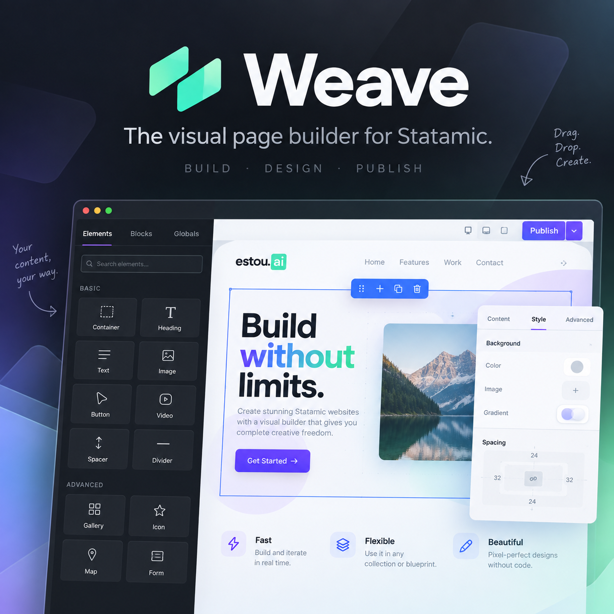

A Statamic fieldtype (weave) for building pages out of a fixed set of
reusable, draggable blocks, edited visually in the CP with a live canvas
preview. See ServiceProvider::bootAddon() for the current registered list —
not repeated here since it'd just go stale.
Adding a block
Two ways, depending on whether the block needs real logic.
Config (no PHP class)
For a block that's just "a Blade view + a props schema" — most content blocks
qualify. Add an entry to custom_blocks in config/weave.php (create
that file in the main app if it doesn't exist yet — Laravel merges it with the
addon's own defaults automatically, no vendor:publish needed):
// config/weave.php (main app)return [ 'custom_blocks' => [ 'quote' => [ 'label' => 'Quote', // shown in the blocks panel 'icon' => 'quote', // Statamic CP icon name 'category' => 'content', // groups blocks in the panel 'view' => 'blocks.quote', // resources/views/blocks/quote.blade.php 'allows_children' => false, // can other blocks be dropped inside it? 'props' => [ ['handle' => 'quote', 'field' => ['type' => 'textarea']], ['handle' => 'author', 'field' => ['type' => 'text']], ], 'defaults' => ['quote' => '', 'author' => ''], ], ],];Every entry under custom_blocks also automatically gets the shared style
props — text/background color, font, border (radius/width/style/color),
shadow, entrance animation, margin, padding, hide on mobile/tablet/desktop —
you don't declare those yourself, they come from Block::styleSchema(). In
the CP they render grouped into collapsible sections (Typography, Border &
Shadow, Animation, Spacing, Visibility) — see PropsPanel.vue's
STYLE_SECTIONS, and "Adding a new shared style field" below if a field you
add there needs its own section.
props uses the same field format as a Statamic blueprint field: handle +
field (type plus whatever that fieldtype needs — options for select,
min/max for range, etc.). Shared style handles use StyleField enum
cases; field type may be a FieldType enum case or a plain string. For
select, options may also be a PHP enum class string; Weave turns backed
enum values (or unit enum names) into option keys, and uses each case's
label() method when it exists. The built-in entrance animation select uses
the Animation enum. A field's default (and a block's defaults) may
likewise be an enum case — Weave stores the backing value. Whatever you list
here is exactly what shows up, unsectioned, at the top of the block's props
panel in the CP.
The view receives $props (the block's own field values) and, if
allows_children is true, $children — render nested blocks with
<x-weave::nodes :nodes="$children" :editing="$editing" />.
PHP class (needs real logic)
For a block with custom behaviour (dynamic default props depending on another
prop, like Columns picking column widths from its preset) — extend the
block class directly:
namespace App\Blocks; use Estouai\Weave\Blocks\Block; class Quote extends Block{ public function type(): string { return 'quote'; } public function label(): string { return 'Quote'; } public function category(): string { return 'content'; } public function icon(): string { return 'quote'; } public function view(): string { return 'blocks.quote'; } public function propsSchema(): array { return [ ['handle' => 'quote', 'field' => ['type' => 'textarea']], ['handle' => 'author', 'field' => ['type' => 'text']], ]; } public function defaultProps(): array { return ['quote' => '', 'author' => '']; }}Then register it — from any service provider's boot(), e.g. AppServiceProvider:
use Estouai\Weave\Blocks\BlockRegistry;use App\Blocks\Quote; BlockRegistry::register(Quote::class);A class block's icon() returns a BlockIcon enum case (CP icon names the
addon's own blocks use — plain CP icon name strings work too), or a raw
<svg> string for a fully custom icon (the CP injects it as-is — only pass
markup you trust). A custom_blocks entry's icon accepts the same values.
A class block can also opt out of shared style fields that don't make sense
for it (a Spacer has no text to color, a Divider has no font) by
overriding excludedStyleFields():
use Estouai\Weave\Support\StyleField; public function excludedStyleFields(): array{ return [...self::TYPOGRAPHY_FIELDS, StyleField::Animation];}There's no config-block equivalent for this — a custom_blocks entry always
gets the full shared set.
Column width isn't a real percentage
Column::propsSchema()'s width field is a flex-grow ratio
(flex:{width} 1 0% in nodes.blade.php), not a CSS percentage, even though
it's scaled 1–100 and labelled with a % suffix. Two sibling columns whose
widths sum to 100 render as literal percentages (50+50, 70+30, ...) — that's
the intended mental model — but a lone column at any width fills 100% of its
row by itself (no sibling to divide space with), and a column at 100 next to
a sibling still at the 50 default renders as 100/(100+50) ≈ 67%, not 100%.
This is deliberate, not a bug to "fix" into a true percentage: a true
width:{n}%/flex:0 0 {n}% doesn't account for the row's gap, so two
columns summing to exactly 100% would overflow the row by the gap amount.
The ratio approach (flex-basis:0 + flex-grow:n) has the flexbox algorithm
reserve gap space before distributing the remainder by ratio, which is
gap-safe by construction. Keep it a ratio; don't switch the CSS mechanism.
Adding a new shared style field
A cosmetic field added to Block::styleSchema() needs the same value mirrored
in a few other places, or it'll misbehave in specific ways:
Block.php— the field itself, instyleSchema().Support/StyleBuilder.php(PHP) — addhandle => ['prop' => ..., 'unit' => ...]toMAPif it's a plainprop:valueCSS declaration. If it isn't (likeshadow, which expands a preset keyword into a full multi-valuebox-shadow, orborder_style's "default to solid when a width is set" pairing) it needs its own small block inbuild()instead — see either of those for the pattern.resources/js/lib/style.js(JS) — the exact same thing, by hand. This mirror exists because the canvas does a live style patch (no network round trip) for cosmetic-only edits — seeCanvas.vue'sstructuralKey()— and that patch is built client-side from this file, not by asking the server. Forgetting this file doesn't break anything visibly on the first render (the server-sideStyleBuilder::build()output is still correct), but every subsequent edit to that field will re-render with the field missing until the next full reload, because the live patch silently drops whateverlib/style.jsdoesn't know about.PATCHABLE_KEYSinlib/style.js— if the field doesn't visibly patch anywhere inbuildStyle()'s output (e.g.animation/animation_duration/animation_delay, which only ever apply outside the editor — seenodes.blade.php), it still needs to be listed here explicitly, or editing it falls through to the canvas's "structural" bucket and forces a full reload for a change with zero visible effect.PropsPanel.vue'sSTYLE_SECTIONS— which collapsible section (if any) the field's header groups under. A handle left out of every section still renders — filtered into the unsectioned "block's own fields" bucket at the top, alongside things likeColumn'sWidth— so this step is cosmetic organization, not required for the field to work.- If the value needs a range/select augmented-default treated as "unset"
(Statamic's
rangefieldtype casts a never-touched field to0during augmentation, notnull— seefont_size) — add the handle to bothZERO_MEANS_UNSETlists (PHP and JS) so a block that's never touched the field doesn't emit a no-op declaration and defeatnodes.blade.php'sdisplay:contentsoptimization.
Live canvas caveat
The CP canvas only does a full network re-render (fetches fresh HTML) when a
block's shape changes (added/removed/reordered/type) or a prop outside the
shared cosmetic set changes — see Canvas.vue's structuralKey() and
SKIP_KEYS. Everything in lib/style.js's PATCHABLE_KEYS instead gets
patched live into the existing iframe with no round trip. That covers every
custom prop a config or class block adds automatically (a block's own props
are never in the cosmetic set, so changing them always does the correct full
re-render) — no extra wiring needed for those either.
How to Install
composer require estouai/weaveThe host project's own package.json needs @vitejs/plugin-vue as a
devDependency (npm install --save-dev @vitejs/plugin-vue) — the addon's own
Vue components compile through @statamic/cms's Vite plugin
(vendor/statamic/cms/resources/dist-package), and Node's module resolution
for that plugin's own import '@vitejs/plugin-vue' walks up from its real
path (vendor/statamic/cms/..., not the addon's symlinked location), landing
on the host project's root node_modules — never the addon's own. Skipping
this fails npm run build inside the addon with
Cannot find package '@vitejs/plugin-vue', not anything more obviously
addon-related.
Publishing on install/update
statamic:install auto-publishes the addon's config (config/weave.php)
and compiled assets (public/vendor/weave/build/...) into the host app —
see ServiceProvider::bootPublishAfterInstall(). That hook only fires on
that command though, so a plain composer update estouai/weave on an
existing install leaves both stale (assets in particular: the CP loads
compiled JS from the host's own public/vendor/weave/, not from the
package directly). Add this to the host project's own composer.json —
note the --force split: assets are generated output, always safe to
overwrite; config is the one file a host app is meant to customize
(nav/footer partials, vite entries, custom_blocks), so it only publishes
when missing, never clobbering an existing customized copy:
"scripts": { "post-install-cmd": [ "@php artisan vendor:publish --tag=weave --force", "@php artisan vendor:publish --tag=weave-config" ], "post-update-cmd": [ "@php artisan vendor:publish --tag=weave --force", "@php artisan vendor:publish --tag=weave-config" ]}Project-specific setup (do this on every new install)
The CP canvas preview (resources/views/preview.blade.php) renders blocks
inside a full HTML page shell so they look exactly like the live site — nav,
footer, and asset bundle included. Those three things are inherently
project-specific, so they're config, not hardcoded — set them in
config/weave.php in the main app (create the file if it doesn't
exist; see "Adding a block" above for how the merge works):
// config/weave.php (main app)return [ 'preview' => [ 'nav_partial' => 'partials.nav', // your site's nav 'footer_partial' => 'partials.footer', // your site's footer 'vite_entries' => ['resources/css/app.css', 'resources/js/app.js'], ],];vite_entries matters more than it looks: if it omits your JS entry, every
block whose Blade view relies on JS (x-data, x-show, a carousel, a map —
anything beyond static markup) renders inert in the CP preview — no error,
it just silently does nothing, while working fine on the live site. Point it
at whatever entry starts your JS (Alpine or otherwise), matching your own
vite.config.js input.
Entrance animations (the Animation style section) specifically need
@alpinejs/intersect registered on that JS entry (Alpine.plugin(intersect))
— nodes.blade.php emits a plain x-intersect.once attribute and relies on
the host app to have the plugin loaded, same as it relies on Alpine core
itself for anything else. This also means entrance animations never play
inside the CP canvas by design (nodes.blade.php only emits the attribute
when ! $editing) — the canvas re-renders on every edit, which would replay
them constantly.
Development
Inside the addon's own checkout (not the host app):
composer test # Pest, via orchestra/testbenchcomposer lint # Pint, check onlycomposer format # Pint, auto-fix